Data Processing 3: Charts
Time to learn: 20 minutes
Put an awesome look on your data and make great looking charts in minutes!
Charts are easy.
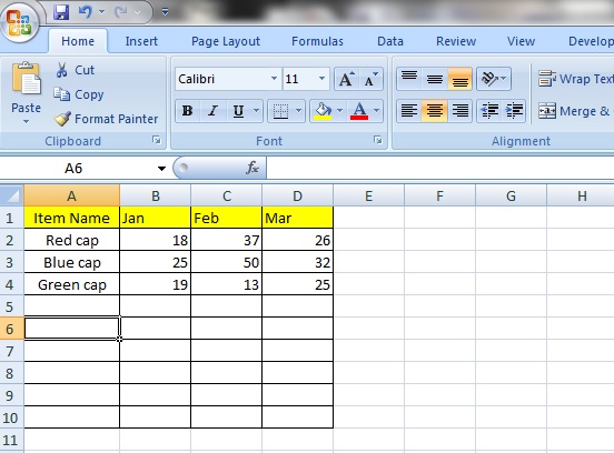
Let’s start with some data. Here we have a list of caps in different colours and how many have been sold in January, February and March.
Now, you see that the list looks like it should be longer than it is now. More on that later.
Step 1:
Select the ‘Insert’ tab and you will see a selection of chart types above the section called ‘Charts’.

Let’s select a ‘Line’ chart.
Step 2:

Now, we will select a ‘2-D Line’ chart. Let’s go with the first one.
Step 3:
A box will now appear.
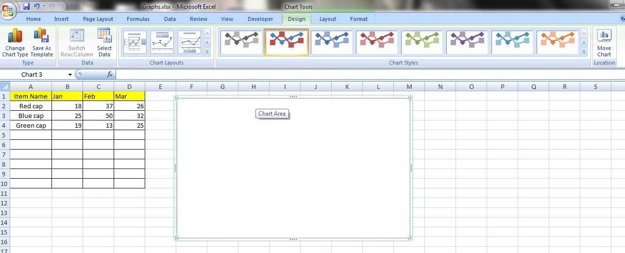
Notice that the ‘Design’ tab contains many of the options that pertain to your chart. The other tab that affects your chart is the ‘Layout’ tab just to the right of your ‘Design’ tab. More on that later.
Step 4:
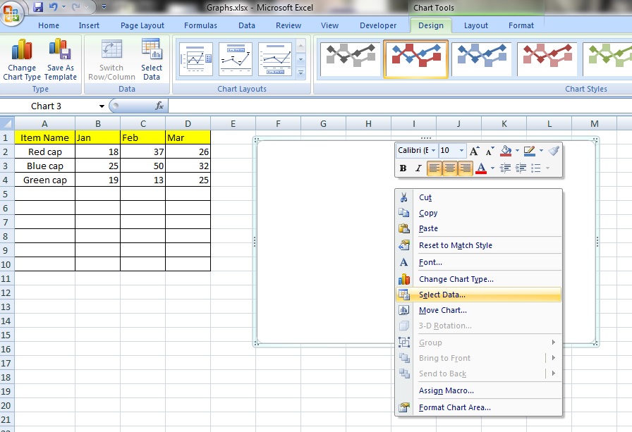
Now, click on the button ‘Design’ tab and click on ‘Select Data’ in the ‘Data’ category.
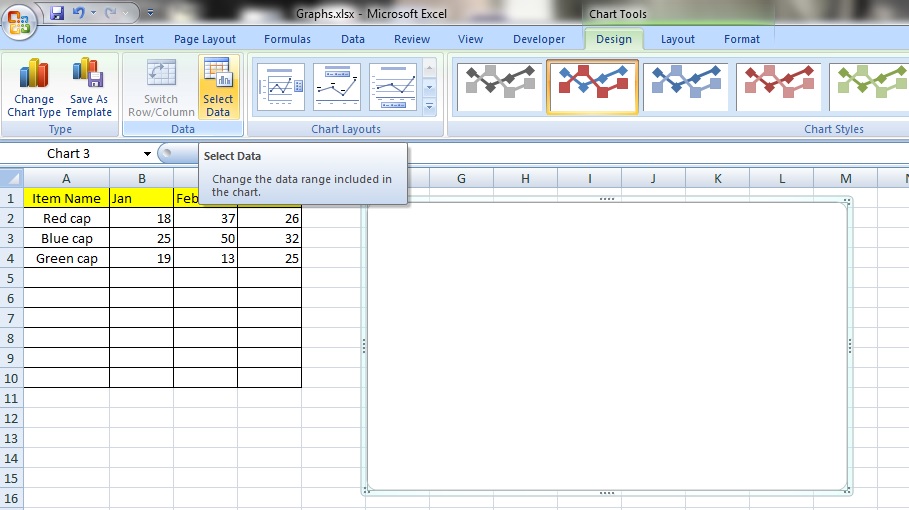
You can also just perform a right click while within the chart box and select ‘Select Data’.
Step 5:
Well, whichever method you choose, once selected, you will see this option box appear. In the field named ‘Chart data range:’, you can enter the cell reference that contains your data by manually typing it in or clicking and dragging to select the whole range. Remember to include the titles of your data in your selection. Click ‘OK’.
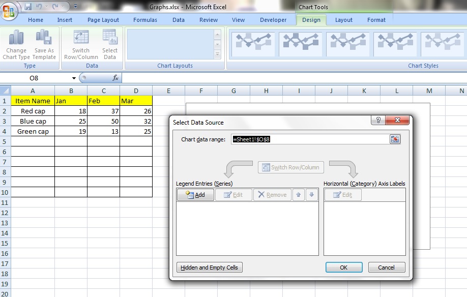
Here, we’ve selected cell reference: =Sheet1!$A$1:$D$4. Notice that it includes the titles from ‘Item Name’ to ‘Mar’ and includes the rows with ‘Red Cap’ to ‘Green Cap’.

Step 6:
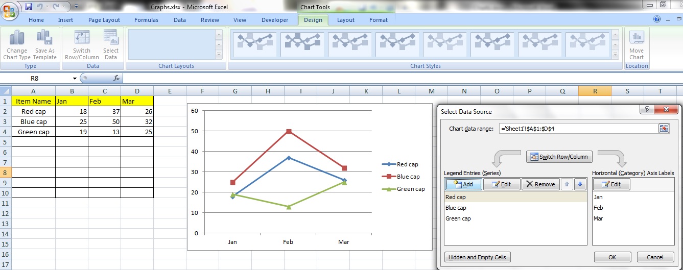
A chart has now automatically been created!
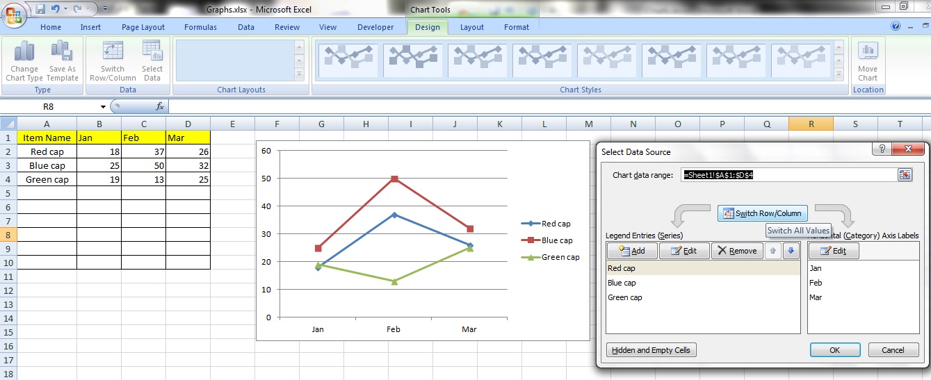
You can change the orientation of the chart by clicking on the button ‘Switch Row/Column’.
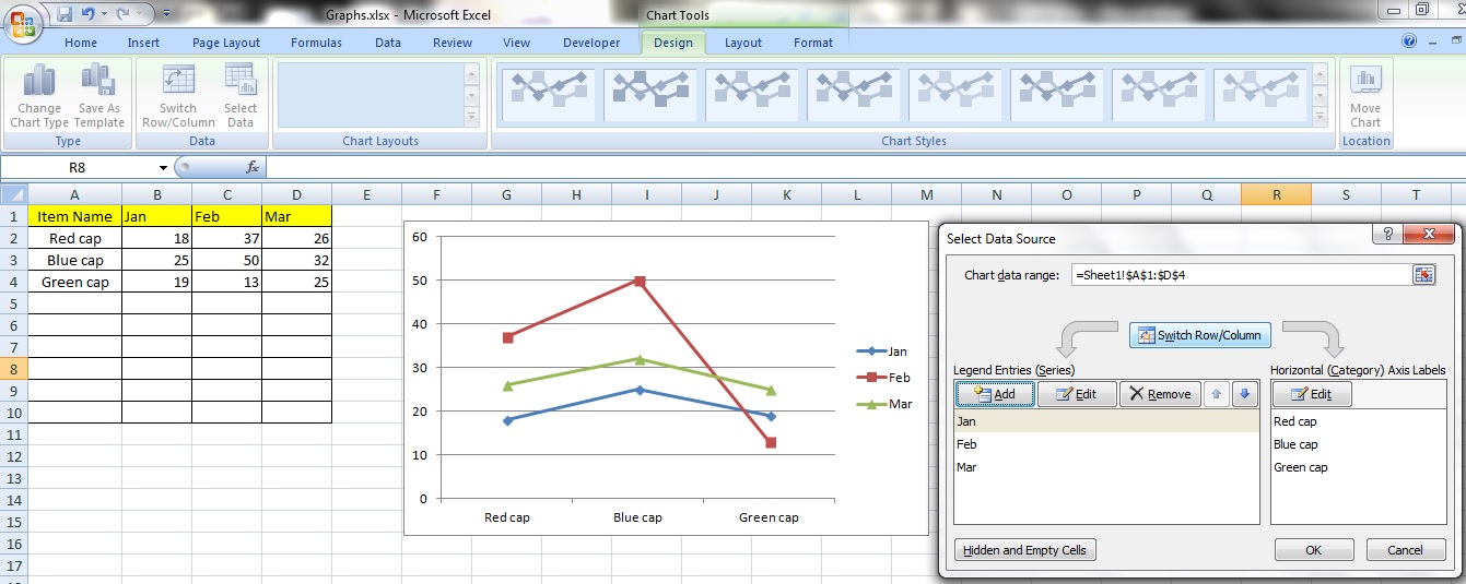
Notice that the axes of the chart are either ‘Jan’ to ‘Mar’ or ‘Red Cap’ to ‘Green Cap’? Nice.
Adding a new series
Step 1:
You can add an additional item to the chart by clicking on the ‘Add’ button in the ‘Select Data’ option box.
Step 2:
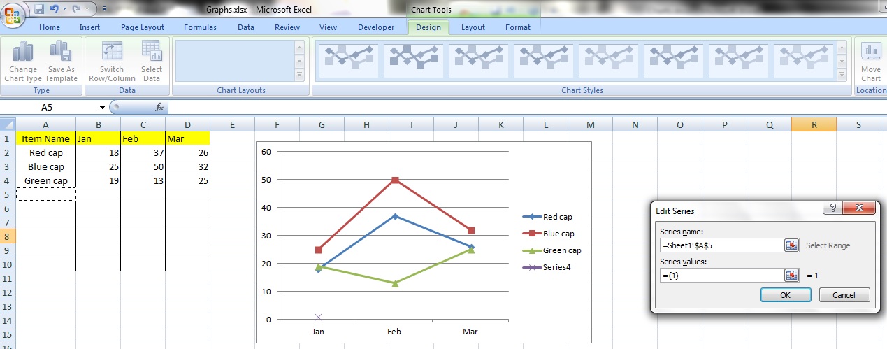
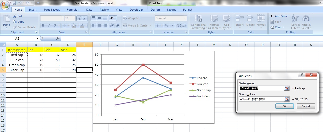
You will see an option box appear called ‘Edit Series’. Under ‘Series Name’ select cell A5 or you can just click on the cell, which would cause this reference to appear ‘=Sheet1!$A$5’. Now, we’ve selected that cell because it is in the same column as all the other names of our items.
Step 3:
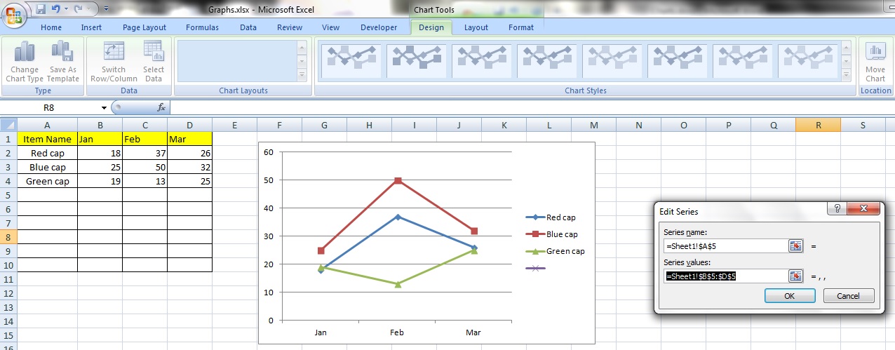
Under the title ‘Series Values’ enter the cell reference for cells B5 to D5. The reference should look like this ‘=Sheet1!$B$5:$D$5’. You can just click and drag to select the cell range too.
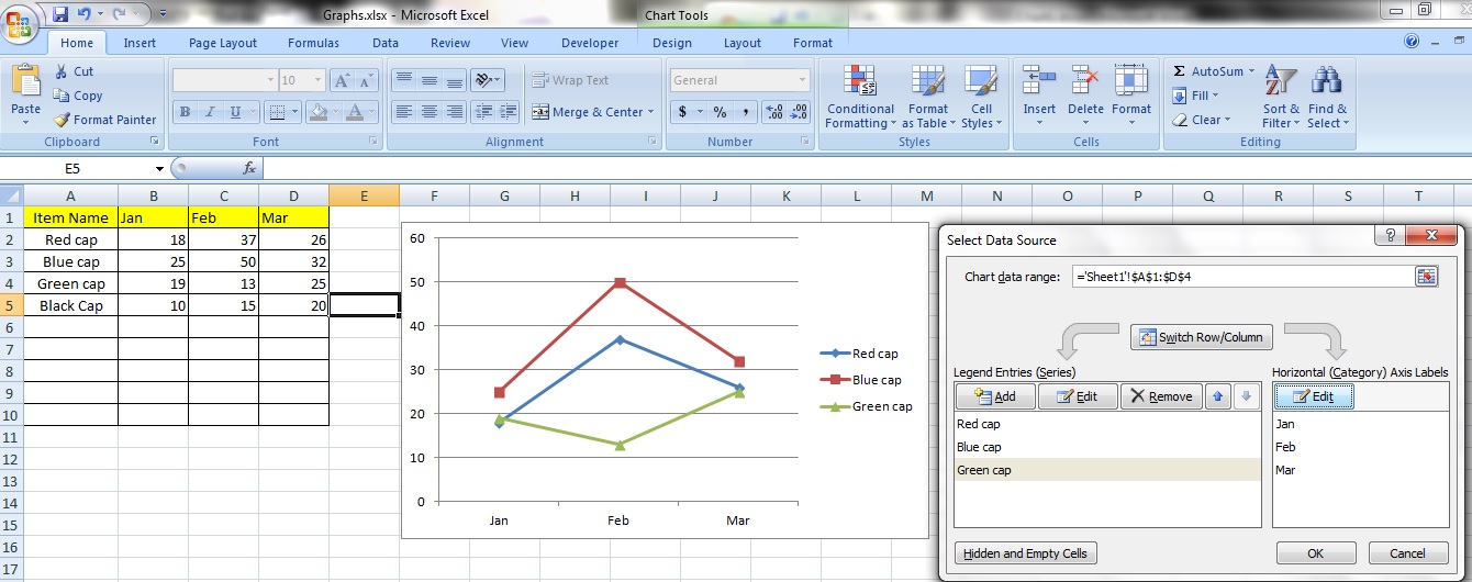
Step 4:
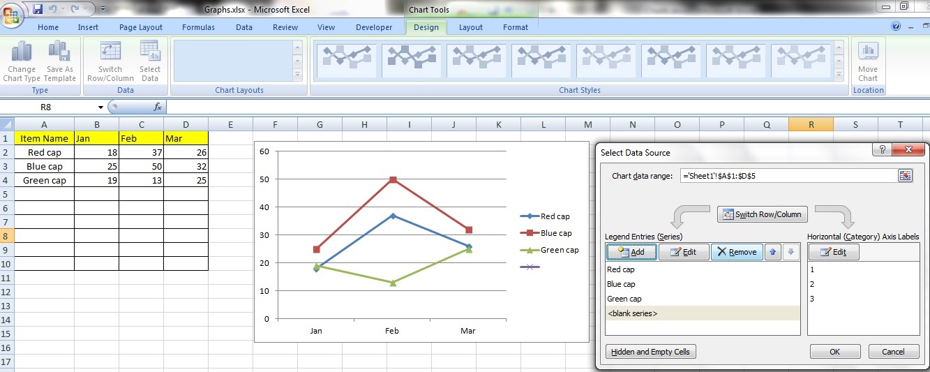
Now, the ‘Legend Entries (Series)’ in the ‘Select Data Source’ option box should include something called <blank series>. Let’s do something about that! Click on the ‘OK’ button to close the option box.
Step 5:
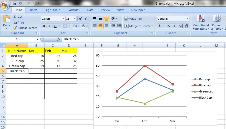
Select cell A5 and enter the text ‘Black Cap’. Notice that a new series called ‘Black Cap’ has appeared on our chart?
Step 6:

Now, enter the number 10 in cell B5, 15 in C5 and 20 in D5. Notice that the chart responds immediately to our data input? Neat. So, that’s how you add a series to a chart!
Editing a Series
Step 1:
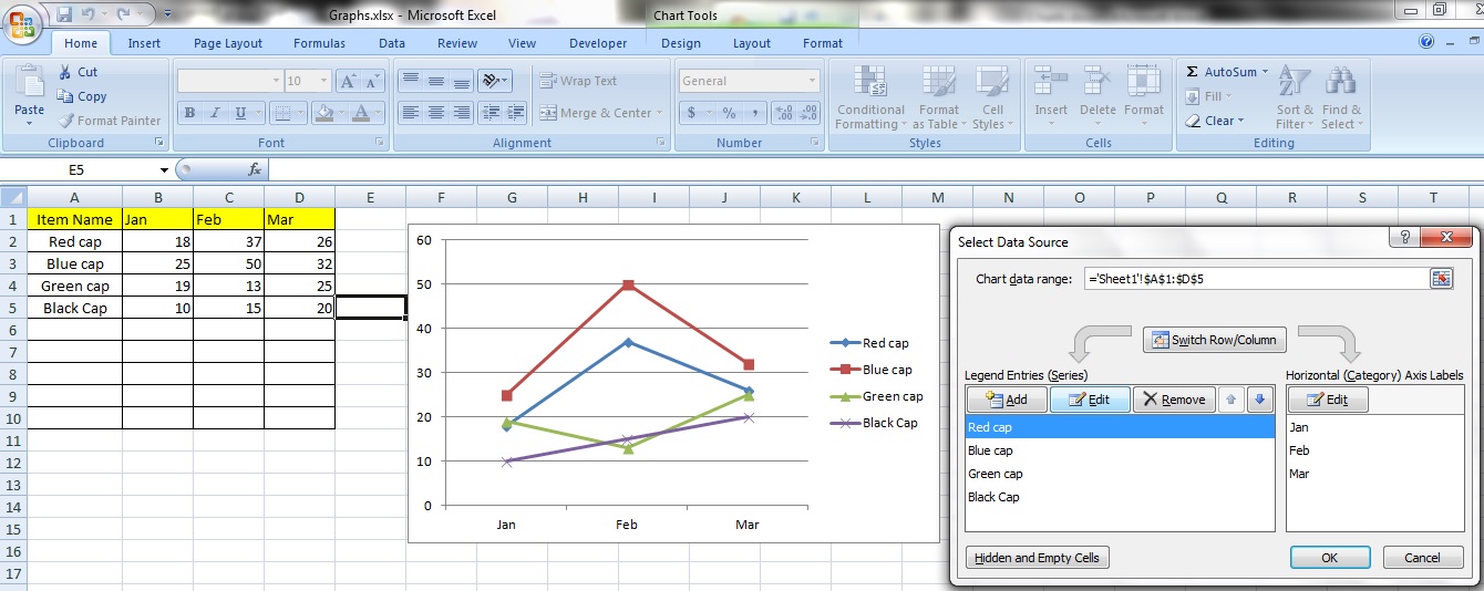
You can also edit the data in a series by going back to the ‘Select Data Source’ option box, selecting the series you want to change and clicking on ‘Edit Series’.
Step 2:
You will see an option box titled ‘Edit Series’. In the field ‘Series Name’ you can either manually enter the cell reference the new name is in or just click on it.
In the field ‘Series Values’ you can enter manually the cell reference the new series’ values are contained in or you can click and drag to select them.
Notice the current values of the cells appear next to this box. This is similar to Step 2 and 3 when ‘Adding a new series’.
Removing a series

You can remove a series by clicking on the ‘Remove’ button. Notice that while the chart has been affected and the series disappears, the table still retains the data.
Changing Axis Labels
Step 1:
You can change the labels of the axes by clicking on the ‘Edit’ button under ‘Horizontal (Category) Axis Labels’.
Step 2:
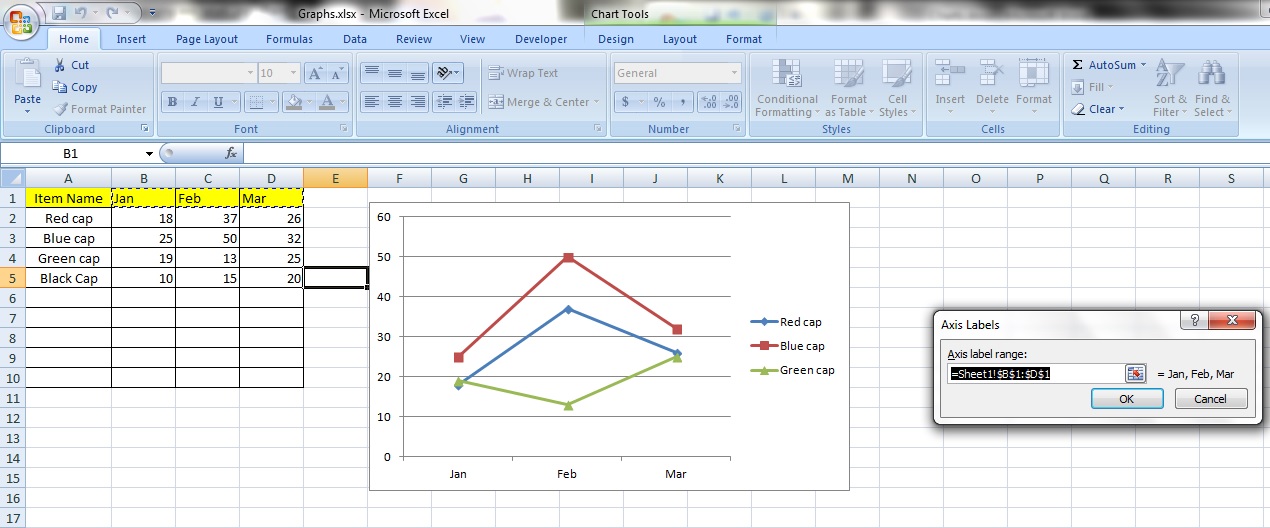
The option box titled ‘Axis label range:’ will appear and you can select a new range of axis labels in the field box. If you want to, that is. Notice the current axis labels appear next to the field box.
Tips:
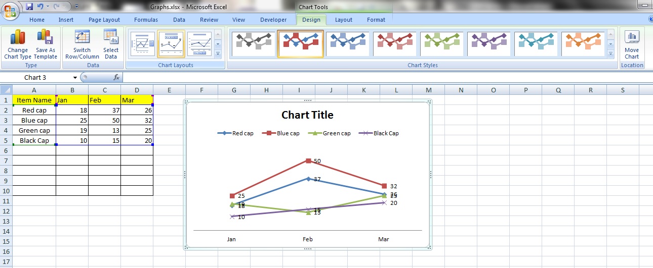
In the ‘Design’ tab, you can change the layout and style of the chart in the categories ’Chart Layouts’ and ‘Chart Styles’. Purely aesthetic.
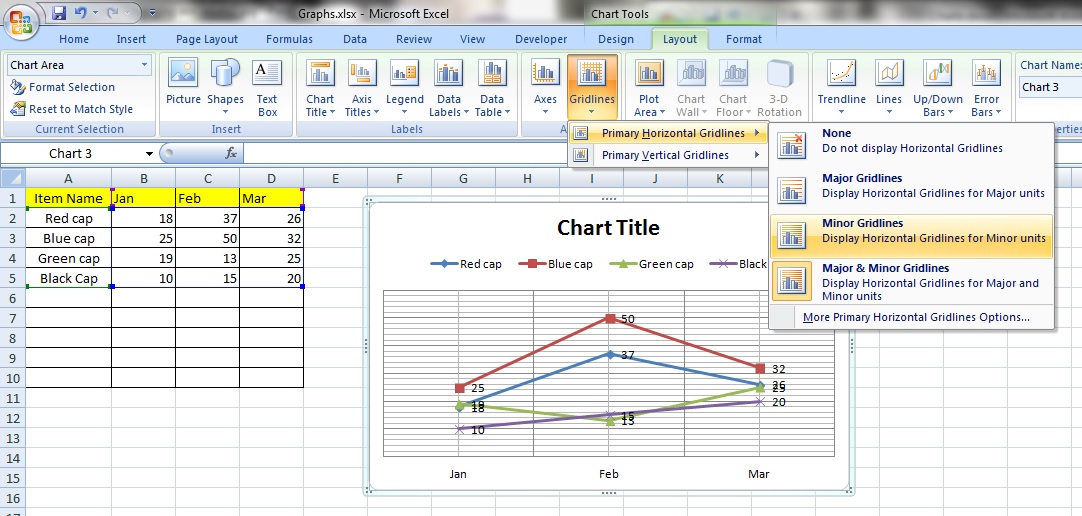
There are host of other frills you can add to your chart in the ‘Layout’ tab.
In this case, we have added gridlines and error bars to the chart readings.
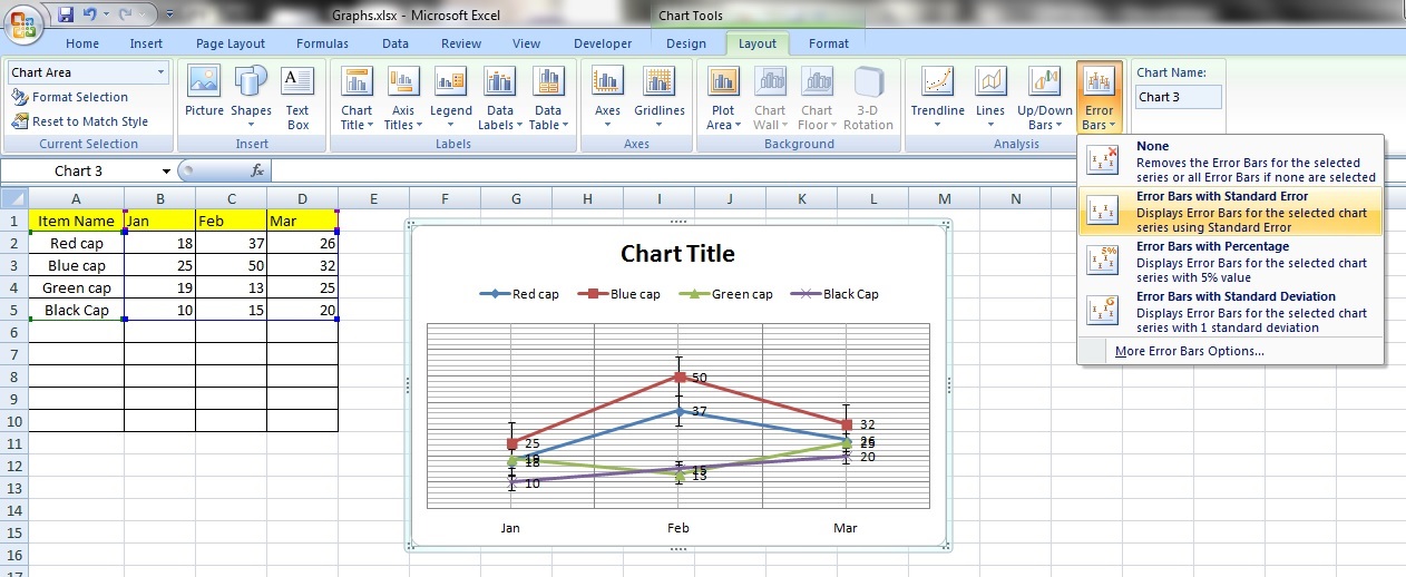
Makes for a more professional looking chart.

Leave a comment